«
Contents
|
Moving the Image: Visual Culture and the New Millennium |
Patrick McNaughton
Indiana UniversityCollaborative Software: A CD-ROM on African Art and Culture
Keywords: African art and culture, multimedia, CD-ROM, teaching and learning
Many people feel CD-ROMs are obsolete and the future is the web, but some projects still seem better suited to a CD-ROM environment. I was the project director for Five Windows Into Africa, a two-disk CD-ROM published in the fall of 2000 by Indiana University Press (Figure 1). The set presents the original research of five scholars - John Hanson, history; dele jegede, popular culture; Ruth Stone, ethnomusicology; Brian Winchester, political science, and me, art history - who explore a variety of topics and issues through specific historic events (such as the creation of Zimbabwe) and typical activities (such as Muslim prayers or public masquerade performances). It involved an intensive, four year-plus collaboration with Indiana University's Teaching and Learning Technologies Laboratory (TLTL), and the cooperative creativity and expertise of quite a large number of people (see the credits at the end of this article). Here I want to describe various features of our product, and give an idea of how we came to create it.
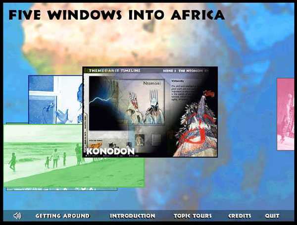
Figure 1. Main Menu, With Icon of the Kono Don Section.
Icons of the five sections float continuously across the screen, with a variety of images from each of the sections in the background. Clicking on an icon takes you to that section.In 1995 Janet Robinowitch, a senior editor at Indiana University Press, suggested a CD-ROM might enhance the press' offerings. Our African Studies faculty had written Africa (Phyllis M. Martin and Patrick O'Meara, editors, Indiana University Press, 1995), a widely used introduction to the continent, now in its third edition. Janet envisioned a CD to accompany and compliment the book.
Many meetings ensued, with interested faculty, press representatives, and David Goodrum, the TLTL director, who wanted to collaborate on the project. We struggled to find an orientation that would bring the project to life. Then a concept emerged, which we called Core Events. Each participating scholar would present an actual event, and use it to explore a constellation of topics and issues that are critical to understanding African culture.
Ruth Stone had a great deal of video on the funeral of an ex-patriot statesman from Liberia, which she felt was an excellent vehicle to teach about African musical performances. John Hanson wanted to present the complicated complexion of Islam in the Ghanain city of Wa, where the history of different sects has generated a great deal of variation in ritual and practice. dele jegede is a native of Lagos, and, given the growing importance of sprawling urban environments in Africa, he wanted to present a cross section of the city's activities, with emphasis on the many ways that artistry, politics and economics interface. Brian Winchester wanted to present the events leading up to the 1979 Lancaster House Constitutional Conference, and then show how that conference helped make white-ruled Rhodesia into black-ruled Zimbabwe. I wanted to present the West African art of bird masquerading through a spectacular performance I had documented in 1978, and explore aesthetic and social dynamics that make some performances influential.
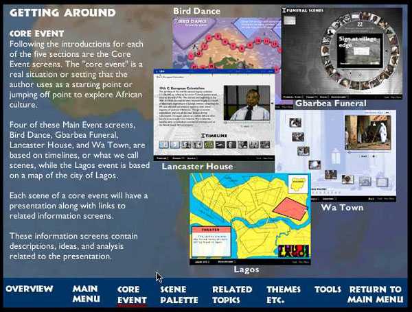
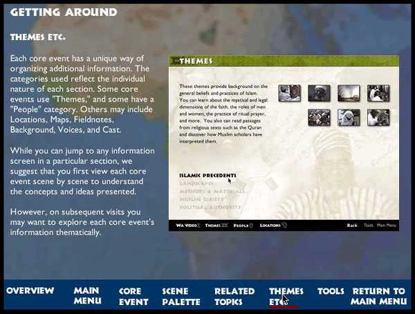
We began with that, and nothing more. So the months that followed saw the serious development of content. Our core events were complex, as expressive culture generally is. We agreed to present them descriptively, with words and audio-visual imagery (Figure 2). Then we would provide an array of analytical themes (Figure 3) that would allow CD-users to explore for themselves the possible interpretations and values associated with the core event, while simultaneously learning about the society in which it occurred. Any of the themes would be accessible at any moment, but we would suggest specific themes for particular parts of the event. When users went to those themes, they would find additional, related topics, which would help make understanding the event progressively richer.
Figure 2. Description of Core Events.
This is part of a series of general information pages in the Getting Around segment, which can be accessed from the main menu. The other pages are listed across the bottom of the screen.
Figure 3. Themes Etc.
This is another of the general how-to screens in the Getting Around section. Note the Related Topics and Scene Palette links.Not surprisingly, we authors knew little about computers. The TLTL lab, however, had a great deal of experience. Its staff had an excellent sense of how content and presentation would have to merge for our project to be successful. They began right away creating screen templates and navigation schemes, as we authors developed media and text content. Frequent meetings allowed us to unify content and presentation.
Each author worked with the lab for about a year, with varying degrees of intensity. Along the way numerous screen styles and navigation schemes were explored and discarded, as we sought an effective structure for our presentation. Integrating media and textual content was our first order of concern, because we authors were simply not accustomed to so vast an emphasis on media (Figure 4). We needed to find a balance between wordcraft and visual thinking, and this took a little time.
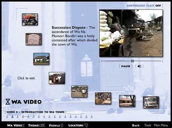
Figure 4. Scene 2 Screen from Friday Prayers
Users see this screen while watching a video on Muslim prayer in Wa. The ratio of text to media is quite different from printed publications.Next came the problem of discovering the most effective presentation for each scholar's material. Every section was going to be very different, and presentation formats that worked best for one would not necessarily work for another. We wanted our five sections to be integrated, while each maintaining its individual character, and this took a lot of lab work, and many meetings between scholars and computer experts. Gradually an overall style was developed that made every section appear well integrated. For example, several muted, full screen images from the section's media content served as backgrounds for every section (Figure 4). Similar in hue and intensity across all five sections, these images provided unification. But at the same time, as users grow increasingly familiar with each section, these image backgrounds would acquire particular significance as conceptual markers of the section's contents. This gave the screens the unique flavour of each section. Tool bars and link buttons were also similar in style across all five sections. But there arrangement differed from section to section, so that they too contributed to an overall feeling of interesting distinctiveness within a broader unification.
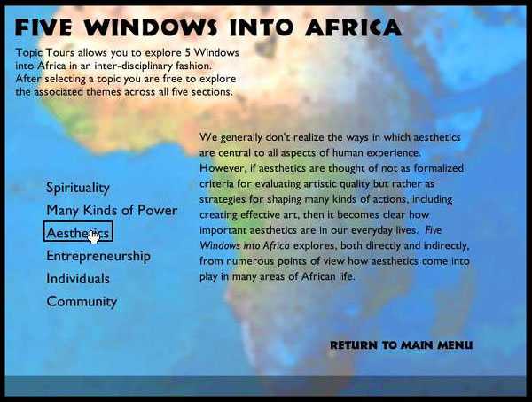
Figure 5. Topics Tour
Accessible from the main menu, this collection of screens helps articulate the common issues and concepts across the five sections.An important way we integrated the five sections was with the Topic Tours, a collection of screens accessed from the main menu (Figure 5). Every project member agreed this was a must from the start, but we added, subtracted and refined this feature for three years, only settling on its final constitution at the very end of the project. After much debate, it became clear that there were five major categories of ideas that weave through all our sections. In the tour, putting the cursor on one of them generates an explanation of what it consists of and why it is important. Clicking produces a list of places in each section that present and explore concepts relating to that category. Each item in the list has a miniature thumbnail that relates to the kind of information it represents, and is a link. These same thumbnails are used to identify links throughout the sections, and, while there are quite a large number of them, they ultimately become familiar enough to reinforce and punctuate the structure of the content. In the Topic Tours, because this is a two-disk set, another icon tells you if switching disks will be necessary.
It became increasingly clear as we experimented with presentation that we wanted the structure of our final product to balance clarity and surprise. It was important that users be able to look at a screen and feel as if just a little thought would allow them to understand it. In other words, we wanted our content situated in a clear structure that could be intuitively engaged so that users could move around easily and feel as if they knew where they were, where they were going, and what they were getting.
At the same time, however, we wanted them to encounter interesting twists and little surprises, so that repeated use offered the possibility of new discoveries. For example, at the most obvious level, Hanson's section on Muslim Prayer at Wa offers a navigation bar across the bottom that reads left to right: Wa Video, Themes, People, Locations (Figure 4). If you click on Locations, you are transported to an interactive map of Wa, where images of mosques and other important sites appear as your cursor passes over their locations. If you click on Themes you get a list of five topics, and when you click on any one of them you are transported to a page where from 6 to 17 thumbnail photographs are arranged in a grid. Each picture represents a sub-theme, and clicking on it takes you to a series of additional pages.
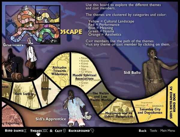
In the section on Sidi Ballo's bird masquerade, on the other hand, my only map is simple and static. The navigation bar offers: Bird Dance, Themes, Cast and Background. If you click to Background, you get a simple list of topics that resembles Hanson's list of themes. But when you go to any one of them, you discover something far more basic and less extensive than Hanson's presentation of themes. If you go to Themes in my bird masquerade section, however, you encounter a very complex screen with themes and sub-themes undulating across the surface like the path of a masquerade dancer or the trail on an adventure board game (Figure 6). Colour-coding is used to demarcate the domain of each theme. Peppered above and below this meandering path are images of the cast of characters. If you click on an image, you go to screen sequences that present information on that performer. If you click on a sub-theme in the meandering path, you go to another sequence of screens. If you click on the last segment of the meandering path, you go to a bird masquerade update, which presents materials I gathered when I revisited Sidi Ballo in 1998.
Figure 6. Theme & Cast Screen from Kono Don
Users can click on sub-themes in the meandering path, or on images of cast members peppered across the screenThus, our goal in all five sections of the CD-ROM was to offer enough stylistic similarity to make users think that many other aspects of the five sections would also resemble each other. They do. But at the same time, expectations acquired while working in one section produce surprises while working in another.
We also tried to create surprise in the midst of clear structure with our links. On the screens that present each section's core event there are links to themes or people who figure importantly in what is going on. Clicking on these icons takes you to a series of information screens that help you interpret the core event. But on these screens there are additional links to other theme and people screens, which the authors think users might find helpful. Sometimes these links seem farfetched to users with little experience of African societies and expressive culture. What do amulets and spiritual powers have to do with public entertainment? Why do images of high-tension power lines and lightning bolts appear on screens purported to be about masquerade performance expertise? In other words, we hope that what appear at first to be odd juxtapositions will peak users' curiosity, and send them to explore links that help them achieve increasingly subtle understandings of the core event.
As suggested earlier, the images used to make the link buttons help accomplish the same thing. Rolling the cursor over these icons generates words that describe the link. But often the words seem unrelated to the link icon. Use makes the relationship comprehensible.
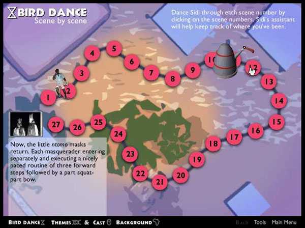
Figure 7. Overview Screen for Kono Don Performance.
Rolling the cursor over numbers gives a brief synopsis of that scene. Clicking on the number takes you there. If you then return to this screen, you will find the dancing, blue-shirted apprentice has moved to mark the scene you just visited.Effective and interesting navigation was an important issue from the start. We knew we wanted navigation to be relatively intuitive. But we did not want it to be too easy, because we wanted users to have to think a bit about what they were doing. So, for example, in the Bird Masquerade section there is a screen that numbers the components of Sidi Ballos masquerade performance, in an imaginary dancer's path around a performance arena (Figure 7). Rolling over each of these numbers gives a pop-up name for that portion of the performance, and clicking on it takes you there. In the Islam and Muslim Prayer in Wa section, however, there is not a specific performance, but rather a video presentation on the nature of Muslim prayer, which is divided into segments. The only indication of those segments is a line of triangles on the bottom of the screen. When you first arrive at that screen the name of each narrative segment flashes in sequence. From then on users will need to experiment by rolling their cursors across the triangles, to see where they might go next. When you roll across each triangle, a pop-up description of the video segment appears (Figure 4).
Figure 8. This is Lagos Sub-Theme with Scene Palette Open.
This feature assists in navigation as well as helping users stay organized while pursuing particular topics in the sections. It could be used, for example, in conjunction with the Topic Tours and the Bookmarks feature to help students prepare presentations.While we made certain aspects of navigation slightly less than obvious, we also facilitated rapid movement for people using our CD to construct a classroom presentation or carry out research for a term paper. We wanted to enable such users to work efficiently, and so the lab developed our Scene Palette (Figure 8). The Scene Palette enhances clarity of navigation, by reminding users of related themes and offering them instant access to each of them. As a user listens to and watches the core event in any section, they are offered links to several themes that help interpret that particular segment of the event. Clinking on any of these links takes you off to a sequence of theme and sub-theme information screens that can be fairly extensive. And, once there, additional, related themes of interest will also appear. A pop-out Scene Palette is always available, however, to remind you of all the original links to the core event scene where you began. Clicking on each of them takes you there, and clicking on the scene number at the top of the palette takes you directly back to the scene itself, where you can resume your examination of the core event. As an interesting aside, this Scene Palette feature was originally more complicated, offering extensive navigational possibilities. But our testing in college classes showed that users did not take advantage of the additional flexibility, and so we scaled the palette back to its present form.
As I suggested above, these goals were not achieved with ease or speed. Authors and computer experts worked tirelessly through many false starts, trial balloons, dry runs-almost any cliché you care to invoke would probably fit here. A particular screen template would be developed, tested for general functionality, and then tested using material from each of the five sections. Often a screen worked beautifully for one section, pretty well for another, and then terribly for the other three. Ultimately we arrived at templates that worked well for every section, in terms of supporting the media and textual content, and presenting it all in interesting, effective ways.
Throughout the development process, once we had a few such screens and could navigate among them effectively, we would run test demonstrations in appropriate classes. Student feedback often sent us in new directions, or helped us to refine particular aspects of screen or navigation design.
When we were satisfied with the results of such tests, we would invite groups of students (between twenty and fourty) to come to the lab or take mock-up CD's home from the lab and experiment with the developing product themselves. We asked them to really put it through its paces, and then respond to a set of general questions, and more specific questions aimed at the effectiveness of specific screen, content, and navigational features. We took this kind of testing very seriously, and many changes resulted. Overall, however, by the time we reached this stage, we discovered that most of what we had done was very well received by our test users.
At this stage several authors took our developing product to lectures and presentations they were giving at other institutions. David Goodrum and I, for example, presented a very interim version of some of our features at the Ninth International Conference on College Teaching and Learning, Jacksonville, Florida, April, 1998. These experiences tended to be in general quite gratifying, because the people who asked questions and talked to us were predisposed to what we had shown. So these efforts offered us sustenance and satisfaction, but not much by way of critique.
With all of our testing, we kept finding little ways to tweak our screens and navigation scheme. We also found it desirable to add or change a bit of content here and there. What began to emerge as our biggest obstacle, however, were code problems. Whenever we tested, and whenever we added or changed something, little difficulties with code bugs would emerge, and, sometimes, they were very heard to find. Once discovered, the fixing of each one lead painfully to an array of additional testing, and often the discovery of another problem.
Meanwhile, the IU Press editors were called in to work over our content, for language mistakes as well as overall clarity. They had been examining bits and pieces all along, but when they started getting whole sections, their work became intense. This was a very difficult product to edit, because text occurred in so many places on a screen, and in so many additional, linked screens. Janet Rabinowitch and Dee Mortensen were up to the challenge, however, and gave us edited 'copy' in a timely fashion. The authors made the corrections while the lab team continued chasing and fixing bugs. Then we edited again, found more bugs, wrote instructors' manuals to put up on the Indiana University Press web site, and, finally, late but exhilarated, we were actually finished.
What had begun as a modest contribution to the CD-ROM world, ended up being a massive undertaking that resulted in something far more extensive and useful than we originally imagined. It has turned out to be a complete work in and of itself, and stands very well on its own, without the Africa book, though the two work quite nicely together.
Our main audience is expected to be undergraduate college students. Orders to the press suggest that Five Windows Into Africa will frequently be used in courses that introduce the history and cultures of Africa. Higher level courses in art history, folklore, ethnomusicology, history, political science, popular culture, sociology, performance studies and anthropology will also find it useful. Students in these more specialized courses will actually be able to carry out research for courses or master's theses in the sections, because each one is a work of original research itself. At the same time, however, the textual and media contents are self-contained and self-explanatory, and the layers of information created by themes, sub-themes and related themes (along with our assortment of background materials) will allow younger users to ease into complex social and artistic phenomena without confusion. We hope, therefore, that Five Windows will also be used by high school teachers when they do area studies.
Now that the project is complete, and our product has actually been published, thinking back over the years of work is rewarding. In the midst of it, however, there were numerous moments when one or all of us wished we had never taken this on. We went from the embryo of an idea, to a lengthy series of realizations regarding just how much we did not know, to a lengthier period of learning it, and, finally, to the satisfaction of having created something useful.
It is a shame to think that, after so many decades of labor by scholars, Europeans and Americans still remain surprisingly ignorant about Africa's history and expressive culture. The Africa book that inspired this CD-ROM relentlessly attacks the misinformation and stereotypes that should have evaporated a long time ago. Five Windows does so as well, and perhaps more effectively, because, as a carefully orchestrated multimedia presentation there are more opportunities for it to make a lasting impression then would just text and illustrations.
September 2000
Credits for Five Windows into Africa
Project Director: Patrick McNaughton
Teaching and Learning Technology Lab Director: David Goodrum
Section Authors: Patrick McNaughton, John Hanson, dele jegede, Ruth Stone, Brian Winchester
Lab Project Managers: Daniel J. FitzSimmons, Frank Morris, William Yang (with Gail Rathbun)
Graduate Student Assistants: John Frazier, Alex Perullo, Daniel Reed
Indiana University Press Editors: Dee Mortensen, Janet Rabinowitch
Testing: Julia Walsh, Thomas G. Harris, Cordah Robinson, Jiangmei Wu, Sheryl Narahara