«
Contents
|
Moving the Image: Visual Culture and the New Millennium |
Mike J. Pringle
English Heritage300,000 Monuments; One VR Model
1. Introduction
Keywords: Information Systems (IS), Virtual Reality (VR), web-based Human Computer Interface (HCI), 3D models, English Heritage, PastScape Project
In response to an ever developing Internet, and the novel technologies and approaches it introduces, the Heritage industry, like everyone else, is having to re-evaluate its own approach to data management and information output. The industry is now becoming more concerned with making data more widely available, and with the necessity to find practical, efficient and usable ways to do so. As an indirect consequence of new government initiatives (Modernising Government), English Heritage is making concerted efforts to make more of its own archival material available to much wider audiences than previously. Unfortunately, because of the technological novelty, and the volume and complexity of information available, taking advantage of the opportunities afforded by the Internet is not as straightforward as it may first appear.1 Computers in general, and Internet or web technologies in particular, are still at an immature stage of development. Furthermore, our understanding of the delivery of information, via these new media, is still at an early stage in the necessary exploration process. For those involved in this process it is easy to be drawn into the implementation of bottom-up, technological solutions, but this approach in isolation will not always lead to the resolution of an information-centred problem. The four-year research behind English Heritage's PastScape project has examined many of the issues associated with Human Computer Interface (HCI) and Virtual Reality (VR). This paper presents a selection of its findings. Some of the research presented in this paper can also be found, with more detailed and expansive discussion, in the author's earlier publication. 2
2. Information Systems
One of the key factors in the development of usable, computer-based, Information Systems (IS), is the distinction, and relationship, between information and system. This is particularly true when the system involves abstract technological concepts, such as VR, that often carry with them a burden of false expectation and unrealistic opportunity. VR can still be perceived as the world of Head Mounted Displays (HMD), sensor-gloves, and surreal movement through an elaborate manifestation of cyberspace; but this view is far from being the only, or even the most common view in the more practical world of IS development. It is very easy to become embroiled in the development of elaborate, and doubtlessly clever, computer systems, but often the greater emphasis, for efficient IS design, should be on the development of the inherent information, its structure, and its representation at the HCI.
2.1 Information
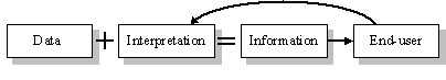
Information, within the confines of any IS, can perhaps best be described in terms of its part within a larger, user-centred process. This process is illustrated, in simplified form, in Fig. 1, which illustrates how information is essentially data that has been interpreted, or placed in context, according to the requirements of an end-user.
Figure 1. The simplified information process.
Two definitions of information, given by O'Brien and Polovina, suggest that information results from the emphasising of salient features of data; and, that information is the organisation of data trends into a form that can be understood in a broader context, and communicated as potential knowledge to others.3 In both cases it is essentially the interpretation placed on data that transforms, or develops it into information. Information, by its nature, is primarily concerned with interpretation4 and not the simple listing of facts, figures, measurements or recordings associated with data. Thus, for any given dataset to have value within an IS, it is important that an appropriate interpretation is placed on it. This can only be fashioned through an understanding of the end-purpose of the particular system, and, in all IS cases, this must be to supply information to the user.
The following section identifies several possible heritage user-groups, in a very broad way, and discusses existing systems and the way that they respond to such users.
2.2 Systems
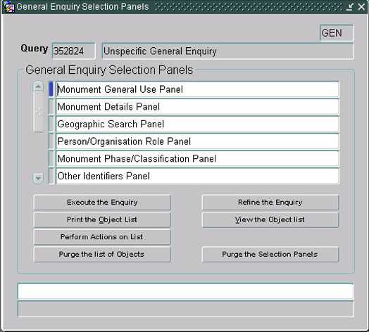
In an internal system designed for professional use, the HCI can elicit manifold, very specific, queries from a user, because considerable understanding, of both terminology and data structure, is assumed. An example of such a system is English Heritage's NewHis system which was designed for input and retrieval of complex monument data. NewHis requires a high degree of understanding of both the data structure and the elaborate terminology used in monument classification, but in the hands of an experienced professional, can return information very tightly aligned to the specific input of the user. By way of a small experiment, the word BARROW was input into an appropriate field in NewHis (a screen-shot of the NewHis general enquiry interface is shown in Fig. 2), and, because it is a specific monument term, a list was returned that related only to barrow monuments. The interpretation of the data, at the HCI, in a system with highly identifiable, and knowledgeable users can closely mirror the underlying data structure. This permits the use of low-level, or narrow, terminology which in turn enables efficient specialist-user retrieval of specialist information.
Figure 2. NewHis general enquiry selection.
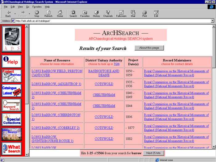
Similar traits can be seen in the Archaeological Data Service's (ADS) online system, which is designed particularly for students with an expressed, or assumed, interest in archaeology or the heritage. In another small experiment, using the same input, BARROW, the system returned a list of objects (illustrated in Fig. 3), that were dominated by the term MORTIMER; hopefully most archaeology students would recognise this as the name of the archaeologist, Sir Mortimer Wheeler, and deduce correctly that the entries do indeed refer to barrow monuments. The ADS's system differs from the purely professional system in that it provides a variety of access paths, each suited to different users. In the example given, a very simple-to-use keyword search mechanism was chosen, and the resultant list closely matched the intentions of the assumed-user. Essentially, this is so because the user has been identified as someone likely to have a fairly sophisticated knowledge of archaeological matters, and would therefore be likely to use appropriate input terminology and have sufficient understanding of the terminology in the resultant list.
Figure 3. ADS results list with additional search facility buttons on left of screen.
Unfortunately many systems are now, especially with the growth of the web, designed for multiple, or vaguely defined, user-groups. As Tudhope et al note, if a system is to be designed to disseminate information to less specialized, or less knowledgeable users, it cannot be assumed that they will understand either the terminology used, or the structure of the underlying data.5 This is true of many public systems; for example, the Internet search engine, which is intended to satisfy a multiplicity of users, searching a vast uncharted database, with an infinite number of different needs. Such systems are usually queried via high-level, broad keyword searches, but invariably return an overload of information that bears very little relevance to the user's requirements. This premise was demonstrated in a final experiment, where again the word BARROW was used, this time input into the Internet search engine, FAST Search. The result, a list of more than 125,000 links to barrow-related websites, showed no evidence of barrow monuments; in fact, the first link on the list was to the home page of Roger Barrow! Inevitably, with a data-set as large, and as varied, as that available on the web, it is impossible for a user to know the inherent terminology or data-structure. Unfortunately, to enable successful information retrieval there is a requirement for the user to have some understanding of terminology or structure; only then can he/she key in specific, or pertinent, terms. The greater the user's understanding, the more successful his/her information retrieval is likely to be. A user wishing to discover the meaning of a collection of curvilinear earthen banks, ditches and large stones, must know what such a collection is labelled as (Stonehenge?) in the database, before he/she can access the available information.
Much current web design practice, to assist the user in finding underlying information, is dominated by lists of 'suggestions', or classifications, that narrow down the query options. These can take the form of, for example, menus, buttons, icons, or hyper-text links, all relating to categories or sub-categories of the HCI designer's interpretation of the underlying data. Such categories are generally contrived in anticipation of the needs of assumed users, but it is very easy, especially when trying to disseminate greater quantities of information to ever-larger audiences, to anticipate too many options, and consequently develop an HCI that is too complex. Every button or link in a hyper-media system can be thought of as a question to the user: 'Is this the category you require or are interested in?' The more questions the system asks, the more like sitting an exam the user's task becomes. What a good HCI needs is less, not more, questions.
3. Human Computer Interface
The HCI is effectively the 'front-end' of any system designed to permit user interaction with, or control of, a single (or multiple) process, whether this be the operating of a manufacturing plant or the manipulation of numerical data.6 For Internet development, the HCI can be seen as the enabling communication facility between users and the information held in a computer (or collection of computers). The HCI provides a user with input devices for giving instructions or requests, and output devices to present responses or information.7 The HCI can be likened to a bridge between the user and information, 8 and the wider the bridge is, the less likely it is to become blocked or bottlenecked. In information engineering terms, the bandwidth of the communication channel between user and information needs to be as broad as possible, to permit maximum access and fluidity of movement through the information. Greater bandwidth is achieved by developing modes of communication.9 This may mean advancing hardware capabilities, such as head-mounted displays and sensor-gloves, or improving the computer's ability to understand humans: voice, gesture, body position or even gaze.10 However, it can also mean improving the way information is presented, and to the HCI designer, this usually means the array of graphic and textual clues, or questions, that are revealed to the user, and the response that each one elicits. It also means having to avoid the potential pitfall of clogging up the screen with an unmanageable quantity of pictures, icons, advice, buttons and links, in an attempt to give users maximum information about the underlying data. Given the range of users and the complexity of information now potentially available, the HCI is in constant danger of becoming overloaded, and therefore more difficult for users to understand or navigate. The PastScape project has focused on a novel combination, of graphics and text, intended to simplify the HCI in a way that improves the user's decision-making process, and thus his/her navigation of underlying data as useful information.
3.1 English Heritage's PastScape HCI
Representing a database to an end-user, whether it is through image or text-based abstractions, or both, can only be of real value if the HCI is itself usable. Greater usability can be assured by either increased intuitiveness in the database structure and/or more intuitive information designed into the interface. The PastScape project's approach has focused on the latter by developing a novel interface architecture that maximizes navigational usability whilst reducing the user's decision-making process. The approach taken was based in part, on combining the strengths of both text and graphics, and as such offers the user new and potentially beneficial alternatives to information access. 11 Because the approach taken, in the PastScape project, involved some new ideas, it was necessary to be able to test the system's functionality in a comprehensive way. Accordingly, the project focused on the construction of a prototype model.
3.1.1 Prototyping
An almost fully functional model, of the PastScape system, was designed and constructed and applied, for experimental purposes, to a dataset gleaned from the NewHis system (mentioned earlier) that relates to some 300,000 monuments in England. The prototype was designed to be appropriate for a conceptual 'intelligent-twelve-year-old', and to present information predominantly through three-dimensional VR models and HTML text. The HCI design also included text-labelling, iconographic navigation aids, and an automatic mechanism for presenting a contextual record of the user's activity. To utilise these various modes of presentation as fully as possible, and to increase HCI effectiveness and efficiency, the project used a novel IS architecture based on clarifying and reducing the number of user-decisions.
3.1.2 HCI Architecture
The prototype's architecture was based on a three-tier layering of information navigation. The top, or entry level of the prototype was designed to provide a contextual introduction to English Heritage's National Monuments Record Centre (NMRC), which supplied the underlying database for the prototype development. The 'home' page of the prototype contained only an introductory paragraph and the English Heritage logo. Keeping the decision making process as straightforward as possible, at this point, a user would only have to decide whether to enter the system or not. By mouse-clicking on the logo he/she would be taken on a pre-programmed fly-through of a VR model of the NMRC, then into a room within the centre, and to a VR model of a computer monitor on a desk. This particular set of metaphors was chosen to reassure the user with familiar contextualization; the user should not feel as though he/she is entering a complex computer system, rather that he/she is simply accessing a building that has useful, computer-based, information available within it.
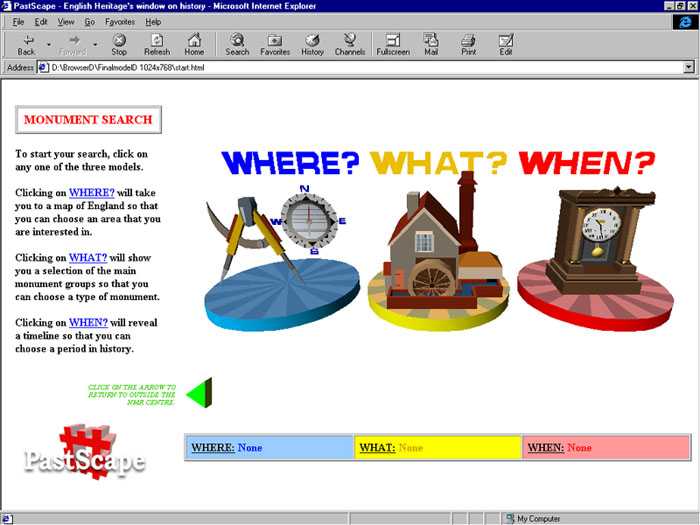
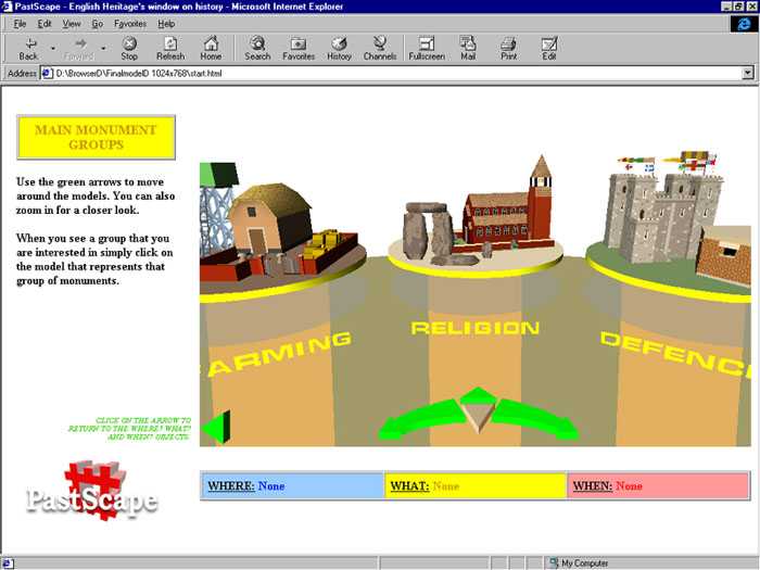
The VR computer monitor, set within the NMRC, presented three VR icons which comprised the core of the second level of information for the user. The three icons were augmented with textual descriptions and labelling, and represented categories relating to monument location (WHERE), type (WHAT) and date (WHEN). These can be seen in Fig. 4. The principle behind such a choice of categories is radically different from the most common approaches to information categorisation currently found on the web. It is more usual, in web-page design, to present users with lists of classifications based on an interpretation of the underlying database. In this respect the three categories are no different, however, instead of determining large numbers of obvious subject divisions, of the underlying data, these three divisions have been composed from identifying commonality across fairly low-level data entities.
Figure 4. The three iconographic VR models representing location, type and period.
Because the prototype was designed to, theoretically, provide access to a historic and archaeological monument information, it was reasonable to assume that all potential users of such a system would be seeking information relating to the data at a monument (single entity) level. By extracting or identifying some of the essential components of every monument it is possible to compile a very clear interpretation, of the entire data-set, at the interface. Every monument must: exist in a place; be a particular type or class; and belong to at least one time period. These categories do not divide the contents of the database into three separate sections, since they all apply equally to all the monuments within the database. Selecting any one of these three categories would lead the user to a more detailed third level of information that relates specifically to the category chosen, and would present a user with a further group of VR illustrations representing appropriate sub-categories: WHERE would present the user with a VR map of England, divided into districts and counties; WHAT, a collection of VR models representing various classes of monument, such as Defence and Religion; and WHEN, a timeline illustrated with dates, period names, and a VR typology of houses. An example of part of one of these sub-category groups, WHAT, is illustrated in Fig. 5. It is highly improbable that any user would come to the system without already having enough knowledge to be able to identify one of these sub-categories as appropriate to their own requirements or interest. To increase user-confidence about which of the sub-categories would be appropriate to his/her needs, they have been conceived to be obviously different from one another; for example, a user wanting information about churches should not have any difficulty choosing the right sub-category from a choice of Defence, Religion or Farming (three of twelve sub-categories). Assuming that users are interested in monuments in general, then it does not seem unreasonable to also assume that each user has a particular type of monument, geographical area or period, in mind.
Figure 5. VR models representing some of the 'third-level' sub-categories of WHAT.
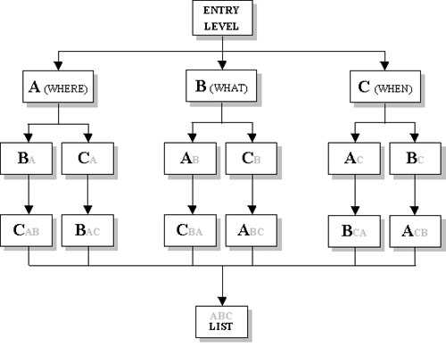
When a selection has been made at this third level, the user would be given an option to view a list of all monuments corresponding to the selection, and would also be given an indication of how many returns (monuments) could be included in such a list. However, because the three second-level categories (WHERE, WHAT and WHEN) are applicable to all monuments, the architecture then offers the two remaining categories to prompt the user into further refining of the possible returns. Having chosen a county, and been informed how many monuments this list contains, the user could, if they so wished, select another second-level category. By selecting WHEN and then Medieval, the user will have isolated the possible results to only those monuments in Wiltshire that are dated to the Medieval period. The user could then view this list, or narrow the possible results down further by selecting a sub-category from WHAT; for example, Religion.
This multi-pronged refining, or filtering mechanism, which is illustrated in Fig. 6, consistently urges the user to make a selection from one of the unselected fields. It also re-presents the choices from the previous level in case new information prompts a change of mind. This format enables the user to move down the structure very efficiently and purposefully. The structure, whichever path the user chooses, will result, ultimately, in the rapid identification of a small and relevant group of monuments. The following example demonstrates how, even with quite a large database, a non-expert user can very quickly refine the potential results down to a manageable number. Selecting the county of Derbyshire, the Medieval period, and the class of Defence, a dataset of approximately 300,000 records returned a list of only 31 monuments. This is the total number of Medieval Defence monuments in Derbyshire. Because the user has determined the three elements common to the returned list (Derbyshire, Defence and Medieval), it is highly probable that the contents of the list will fulfil the user's information requirements.
Figure 6. Three-pronged filtering mechanism. (Bold letters indicate possible choices and grey letters represent choices that have already been made.)
This architecture, instead of offering lengthy lists of subject-divisions to the user, asks him/her to consider only one third of a query at a time, then offers a multiple-choice of fully illustrated answers, before attempting to elicit the next third.
3.1.3 Further Usability at the HCI
The overall design strategy for the PastScape project was to create a clean, uncluttered HCI with images and language aimed at making the system comfortable for a member of the targeted 'intelligent-twelve-year-old' user group to use. To further assist in navigation, the models comprising the third-level sub-category groups were clearly labelled (with text headings), and further clarified with mouse-over tips. Furthermore, a concise paragraph of explanatory body-text, and a record of user-history were designed into the overall framework. The body-text, which would alter according to user-selections, was included to explain available user-choices, prompt further decisions, and give an indication of how many returns could be expected from a search based on current selections. The text also included hyper-text links that corresponded to the three main icons; clicking on one of these links would have the same effect as selecting its equivalent icons. Additionally, the text provided an automatically generated 'written' record of user-history, relating any selections that the user had already made. User-history is a very important consideration in the design of any IS interface; such a facility can not only inform a user where he/she has already been, but the information can enable the system to offer sensible options for where the user may like to go next. 12 Consequently, as well as the textual inclusion, two other elements of the prototype 3D were designed to include and exploit the advantages of user-history: a history table to provide a constant reminder of the user's activity; keeping a record of any county, monument type or period that the user had already selected and the number of possible returns that such selection would generate; and, the inclusion of colour coding whereby all elements relating to a particular category followed the same colour scheme, and changed, in the same way as visited hyper-text links, when selected.
Two other elements were necessarily included in the HCI: the back button and the view button. The back button was included to enable the user to return to a previous level by reloading all the frames within the browser window (the prototype contained six different frames, but default browser back buttons only reload the last frame loaded). Selecting the view button would reveal the list of available monument details.
3.1.4 Information Output
For the purpose of development, the prototype utilized the database of the already established NewHis system, with only minor amendments relating to the level of detail that would be returned in a list within the PastScape model; this would obviously be much simplified, or filtered, as appropriate for an 'intelligent-twelve-year-old'. Consequently, the prototype returned a list of links to automatically generated HTML pages of monument information, with each page giving basic details, and available text and pictures for that monument. However, although many users would be satisfied with this particular level of detail, the system's design was not restrictive. The architectural principles applied in the prototype would, as mentioned earlier, permit the user to extract a higher level of information; for example, the user may request to view a list of all the monuments in a given county, or all religious monuments of a particular period. It could also allow the user to access lower level material from within the database, each individual page could include links to further, more detailed, information.
4. Summary
It is imperative, if any HCI is to be of value, that the development process recognises the diversity of inherent elements, and responds to them in a positive way. This paper has presented a project that has acknowledged the complexity of designing a web-based interface, and has outlined some of the ways in which the project has attempted to resolve some of the issues, particularly regarding user-navigation, or HCI usability.
English Heritage's PastScape prototype has been designed to present the user with an uncluttered, and intuitive HCI to complex heritage data. The HCI was constructed with familiar, real-world metaphors (three-dimensional graphic images), combined with instructive text, clear and varied labelling, and simple iconography. It presented a contextual picture of the underlying data, via a simple filtering architecture that imparted a high level of information value at the interface. The simplicity and clarity, offered by such an approach, has been contrived to enhance the user's ability to decide on an appropriate course of action, and to diminish his/her chances of becoming disorientated or lost within the interface. The system user, who should always be the key consideration in any IS development, should be able to navigate information in a quick, fluid, and productive manner, even if he/she has little or no specialist knowledge of the data structure or the terminology used within it.
September 2000
Notes
1. Barrett, R. & Maglio, P. P (1998), "Informative things: How to attach information to the real world", pp. 81-88. Proceedings of the ACM Symposium on User Interface Software and Technology.
2. Pringle, M. J. (2001), "Using Virtual Reality to Improve Public Access to Heritage Databases over the Internet", in: Stancic, Z. & Veljanovski, T. (Eds.), CAA2000 - Computing Archaeology for Understanding the Past, British Archaeological Reports International Series. (Forthcoming)
3. O'Brien, S. & Polovina, S. (1997), "Web Design and Information Architecture", Proceedings of the Sixth International World Wide Web Conference, Santa Clara, Ca, April 7-11.
4. Davies, L. J. & Ledington, P. W. J. (1991), Information in Action, London: Macmillan.
5. Tudhope, D., Taylor, C. & Beynon-Davies, P. (1995), "Semantic Navigation Tools for Museum Hypermedia", Computers and the History of Art, 5.2, pp. 51-63.
6. Inverso, D. & Sokoll, R. (1997), "Optimum Human-Machine Interface Design", Control Engineering, 44.12, pp. 93-97.
7. Murray, N., Goble, C. & Paton, N. (1998), "A Framework for Describing Visual Interfaces to Databases", Journal of Visual Languages and Computing, 9, pp. 429-456.
8. Balint, L. (1995), "Adaptive Human-computer Interfaces for Man-machine Interaction in Computer-integrated Systems", Computer Integrated Manufacturing Systems, 8. 2., pp. 13-142.
9. Sharma, R., Pavlovic, V. I. & Huang, T. S. (1998), "Toward Multimodal Human-Computer Interface", Proceedings of the IEEE, 86.5.
10. Billinghurst, M. & Savage, J. (1996), "Adding Intelligence to the Interface", Proceedings of VRAIS, IEEE; Brooks, F. (1996), "The Computer Scientist as Toolsmith", Communications of the ACM, 39.3, pp. 61-68; McKillip, R. C. & Corona, B. M. (1997), "Advanced Human Computer Interface for the Army After Next, Proceedings SPIE, 3080, pp. 203-211.
11. Ucko, P.J. (1992). Foreword, in: Reilly, P. & Rahtz, S. (Eds), Archaeology and the Information Age: A Global Perspective, London: Routledge.
12. Hightower, R. R., Ring, L. T., Helfman, J. I., Bederson, B. B. & Hollan, J. D. (1998), "PadPrints: Graphical multiscale web histories", Proceedings of the ACM Symposium on User Interface Software and Technology, pp. 121-122; Rossi, G., Schwabe, D. & Garrido A. (1997), "Design reuse in hypermedia applications development", Proceedings of the Eighth ACM Conference on Hypertext, pp. 57-66.