|
|
Digital Art History? Exploring Practice in a Network Society |
John Calvelli
The Art Institute of Portland, Oregon, USAArt History, Design and the Digital Database
Keywords: art history, design, images, meaning, database
This paper is about culture, in particular that aspect that deals with visual language, both pictorial and written. I write not as a traditional art historian, but as someone who was exposed early on to the Metropolitan and the Modern Museums in New York, and who went the way of the artist at first, then designer and art director, brand strategist and currently design professor.
Along the way, due to my abiding interest in art, I worked in three art museums, eventually becoming the director of the graphic design department at The Museum of Modern Art in New York, which produces the graphic design for exhibitions, publications and marketing.
In the year 2000 I left the museum for a migration westward, to San Francisco, to consult on Internet brand strategy for clients of KPMG Consulting. When the Internet bubble burst, I took time off, spending the summer on my in-law's farm in the Pacific Northwest to figure out what to do next. Which brings me to the subject of my paper.
Art History, Design and the Digital Database: A Case Study
A refugee from California and New York, I was in a beach house in Oregon overlooking a foggy coastline and the Pacific Ocean. I placed a call to the academic department director at the Art Institute of Portland who was to hire me to develop a course in the history of graphic design, in order to finalize the arrangements and get started on the project. She proceeded to relate to me what had happened to the World Trade Centers and the Pentagon. The rest of the weekend was spent in a fog – literally, a heavy one, in front of my eyes – punctuated with assaulting and arresting visual images of the attacks on the monoliths.
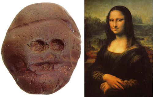
Fig. 1. African mask, 3 million BC. Mona Lisa by Leonardo, 1506.
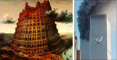
Whether taken by a photojournalist or captured by satellite; painted by Leonardo (Fig. 1) or by Breugel (Fig. 2); created by Malevich or drawn by Tatlin – there is no existing disciplinary model for understanding images that is definitive or exhaustive of the meanings that they convey to us and the value (or values) they have for us. This is why I began to develop a course in graphic design using a database model, with its potentially infinite archive and its defining filtering and sorting systems.
Fig. 2. The Tower of Babel by Pieter Bruegel the Elder; The Twin Towers of the World Trade Center
in New York on 11 September 2001.Yet the critical undertaking of a teaching institution remains not the technology but the instruction of a student, particularly for a school like the Art Institute of Portland – one of 24 design schools and colleges across the United States, owned by a company. Its mission is to provide a design education that will lead to an entry-level job in the student's chosen field.
Thus, the key to the course I developed is based on two concepts fundamental to graphic design commercial practice – and, I maintain, fundamental to any understanding of art and design throughout history: the concepts of meaning, and value. I express it in my syllabus as such:
When considered telescopically within an historical framework, graphic design becomes a cultural artefact. By considering it as artefact, we can look at the larger meaning that the practice of graphic design has on culture and society; and we can also analyse how it has created value for the culture at large. By understanding how meaning and value operate historically within the practice we call 'graphic design', we are more able to understand our own contemporary practice as designers: solving communication in a meaningful way that has value for our client, and the audience or end-user.
By choosing to use a database, a number of intriguing instructional possibilities also presented themselves:
1. I could enlist the help of students in expanding the database;
2. I could leave the students at the end of the course with a database of their own;
3. I could create a structured assignment that would help develop an understanding of the 'meaning/value paradigm' the course was based on.I chose Filemaker Pro Developer as the software for the course, as I was familiar with it as easy-to-use cross-platform database software; and it allowed me to develop stand-alone applications that I could distribute to students. (It was decided a more ambitious network database was too costly to implement.) A colleague of mine from graduate school in Los Angeles, Charles Field, had an initial collection of slides to begin populating the database. We decided to collaborate on aspects of the database design, with the understanding that it would be for 'fair use' educational purposes, and that the sharing of material would benefit us both in our research interests.
Over a week-long period in San Francisco we began our digitising the images and developing a design for the basic interface for database entry, value lists for sorting purposes, and other basic functionality. Returning to Portland, I continued my research for the course, adding images and developing the functionality to deliver the course at the Art Institute. This included:
- a research database for entering information from the Internet;
- a bibliographic database;
- a lecture planning database (used both for planning and delivery);
- an assignment database, developed as a stand-alone, freeware application;
- and eventually, a grading database.
All of these databases were, of course, linked, centring on the lecture planning and assignment databases.
To develop a lecture, I choose images in a layout from the initial entry database and import them into the lecture database via their Collection ID number. I use one layout to sort images into a sequence for presentation and another to plan. The planning layout has fields from both the entry and research databases, allowing me to synthesize both information noted from image entry as well as research found on the subject of the image from the Internet or other sources. Finally, I project the lecture using a separate layout in the same lecture database.
The assignment database is central to the entire course, as it is based on the analysis of images chosen by the students from the point of view of the core concepts 'meaning' and 'value.' I structured the layout to encourage the student to formulate the meaning and value of the image in two concise statements, with an additional field to bring into play other information and analysis to support the statements. In addition, for each image, the student enters caption information (including copyright) and database sorting values, such as period, discipline, etc. Each week the student completes an assignment and delivers it to me electronically for grading. Periodically, a portion of the lecture is devoted to a presentation of the images with the student providing their analysis for the benefit of the others.
In a class of 25 students, we are able to collect a database of up to 250 images.
At the end of the term, I distribute back to the students a revised freeware application containing the class database. This can become the basis for an evolving database of images for the design student's personal use in their practice - an inspiration file, as it were. Together with – I hope – an astute awareness of how images communicate meaning to provide value, I feel I have provided the student with an initial basis for a lifetime of visual practice, relevant to their needs as professional designers and in their responsible capacity as both subjects and producers of visual history.
There were and continue to be, several challenges to the development of this course, not least of them the electronic component. I developed this course as an independent, adjunct instructor in a matter of a few months, left largely to my own devices. There were cross-platform issues to deal with; the need to quickly design an application that would be easy to use and reliable; software distribution and assignment submission issues; and the electronic equivalent of paperwork in order to keep track of student progress, grading, etc. Nevertheless, students have responded to the course generally favourably. I was pleased upon reviewing course evaluations for the spring term that many students singled out the helpfulness of the meaning/value paradigm in increasing their understanding of the course material.
Most recently, I am in the process of revising the course material, responding both to student input and to my interests in the larger story of visual representation and the opportunities afforded by the database model. For the first two terms, I organized the course on a largely traditional chronological model, with design, fine art, writing, illustration filtered through my attempt to revisit the entire history of visual representation according to a design-dominant paradigm. I have now re-organized the course such that each lecture now encompasses both the historical and the contemporary, presenting a slice of the database pie; a story, in other words, that begins with a database sort of visual images.
I now begin the course on week one with a presentation using the previous terms' assignment databases to initiate a working discussion of the meaning and value concepts. The next two lectures both span prehistory to the present, the first from the perspective of picture-making and the second from that of the history of writing and typography. The fourth lecture – given the week before the midterm – presents the 'official' history of graphic design – a practice I define as involving the use of images and words disseminated using the effective media of its time – and largely defined by the one comprehensive text that is available, Philip Megg's A History of Graphic Design. On week five the students take the midterm, following which we review the 'meaning and value' assignments from the first half of the term. The second half of the course presents case studies in graphic design (such as the Bauhaus, American design, etc.). The final lecture on week ten presents contemporary work, filtered through recommendations presented by colleagues in the field, including the student's own submissions for their last assignment.
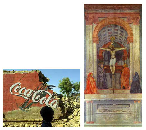
Fig. 3. How we go about studying and understanding symbols?
The case study presented above came from a specific opportunity to help students fulfil the curricular requirements for the Bachelor's degree in Graphic Design at the Art Institute of Portland, and as such, to provide them with lifelong learning tools for their practices as designers, illustrators, typographers, or art directors. I presume I am addressing that challenge. I hope it also provides a potential model for how a database can be used to teach design or art history. I would also be happy if it created a little wonder about our use of symbols, and a few questions about how we go about studying and understanding them, be they pictures or texts, paintings or layouts, Coca-Cola or the Catholic Church (Fig. 3). This is not a polemical agenda; rather, it is more of a hermeneutic quest based on seeing, practice, and query - and one assisted by the filter, find and sort of a modest database of fifteen hundred images and counting.
November 2002