|
|
Digital Art History? Exploring Practice in a Network Society |
Emilie Gordenker, formerly Gallery Systems
and Cristiano Bianchi, keepthinking DigitalCollaboration: Building a Kiosk for Digital Responses
Keywords: digital art, online exhibition, Victoria and Albert Museum, London
Introduction
Museums can be much more creative about what they do online. While many have begun to provide access to their collections on the Internet, few do more than display basic documentation and a list of pictures. Increasingly, museums are required to provide interpretation as well as visual appeal on their websites. In effect, museums should now be thinking about creating online exhibitions. And to do this right requires the collaboration of curatorial staff, art historians, technical experts and designers.
To date, the most useful museum websites have been those that put a considerable amount of collections information online. Examples are well-funded national museums such as the National Galleries in London (www.nationalgallery.org.uk) and Washington (www.nga.gov); smaller organisations servicing museums such as the Art Fund; as well as regionals (Sheffield Galleries and Museums Trust has put the metalwork collection online, with New Opportunities Fund (NOF) funding (www.sheffieldgalleries.org.uk). The ability to search an entire collection by artist name, date or keyword, and to produce a list of pictures with some explanatory text is a leap forward, useful to a range of people, from fist-time visitors to scholars.
Only a handful of museums have ventured beyond a display of documentation, but have presented ideas or themes tied to a collection online. A good example is the collaboration of the BBC and the National Gallery in London, called Painting the Weather (www.bbc.co.uk/paintingtheweather). A few museums have made real use of the medium to present new research. A conservation project on Mondrian at the Fogg Art Museum at Harvard, resulted in a CD-ROM and website (www.artmuseums.harvard.edu/mondrian). Truly imaginative projects are few and far between, and far more common for museums that deal with history or ethnography. A good example is the Jasenovac site on the US Holocaust Memorial museum website, that creates a real atmosphere and narrative about the holocaust in Croatia (1941-1945) (www.ushmm.org/jasenovac). Another is not linked to a particular museum, but shows a vast amount of information about the Egyptian Valley of the Kings, all drawing on a database (www.thebanmappingproject.com).
Some museums now show digital art on their websites. Several American museums have amassed a significant group of projects and have made these available online. I am thinking of the Whitney's Artport (www.whitney.org/artport), DIA Center (www.diacenter.org/webproj), Walker Art Center (www.walkerart.org/gallery9) and San Francisco MoMa (www.sfmoma.org). In the United Kingdom, the only major museum that has made a serious foray into the presentation of digital art is Tate (www.tate.org.uk), but it has commissioned and launched only 4 projects, and so is considerably behind its American counterparts. Other players in the UK are the Institute of International Visual Arts (www.iniva.org) and the Institute of Contemporary Arts (ICA) New Media Centre (www.newmediacentre.com), but neither match the scope or quality of the leading US museums in the field. Baltic (www.balticmill.com/), is a new player in the field, and what it does remains to be seen.
Some of the best examples of digital art presented by museums are carefully selected projects that are clear, easy to download and use, and have artistic merit, even when this is light-hearted, such as James Buckhouse's Tap (www.diacenter.org/buckhouse). This was a big hit at the last Whitney biennial and now to be seen on the DIA site. Others have a more trenchant intention, such as Martin Wattenberg's A Net Art Idea Line on the Whitney Artport (www.whitney.org/artport). This graphic history of Net Art should really make us historians think in a new way about the history of this very fresh form of art.
The point I am coming to is that there is a world of difference between projects that publish documentation on the Internet or that commission cutting-edge digital art, and a true online exhibition. A successful online exhibition requires many of the same elements that a physical exhibition does. These include:
- having a clear vision of what is on display and why;
- creating a distinct atmosphere – i.e. worry about lighting, background (or wall) colour and the flow of the works from one space to the next;
- relating exhibited works in a meaningful fashion;
- presenting sufficient background information to keep the visitor well-informed and interested.
I was recently offered the opportunity to think about these issues and put some ideas into practice at the Victoria & Albert Museum.
Digital Responses: Background
Digital Responses is taking place in the Design Now space in the 20th Century Galleries of the Victoria and Albert Museum, London. Opened in May 2002, it is the venue for a series of displays by artists who use digital media in their creative processes, and will continue until 9th March 2003. The project is curated by Paul Coldwell of the London Institute, and is a contribution to a joint research project, The Integration of Computers within Fine Art Practice, between two well-known London art colleges within the London Institute: Camberwell College of Arts and Chelsea College of Art and Design.
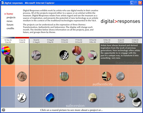
Fig.1. Digital Responses. Online exhibition at www.vam.ac.uk and www.keepthinking.it/digitalresponses
All the work is new and specific to the Victoria & Albert Museum. Seventeen artists are creating work in response to either a space or an artefact within the Museum. They are working in a wide range of approaches to the new technology, from the discrete through the interactive.
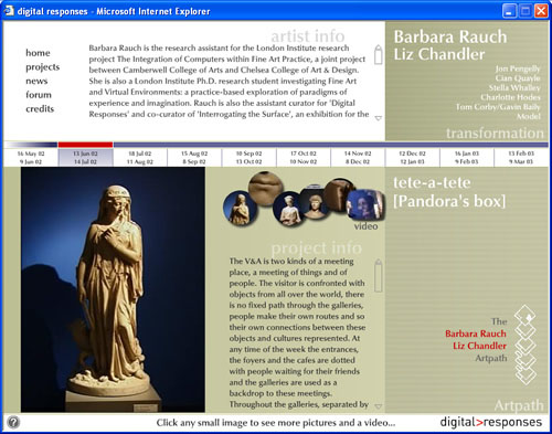
Fig.2. The Digital Response by the artists, Barbara Rauch and Liz Chandler.
In the summer of 2001, the V&A and the curator, Paul Coldwell, approached the company where I was working, Gallery Systems, about developing an in-gallery kiosk. Although the list of artists had been selected and a space in the museum allocated to the show, it was still in its beginning stages in terms of display and organisation. I had the great fortune of meeting Cristiano Bianchi, of keepthinking (www.keepthinking.it), who joined the project in its early stages, and not only contributed the design, but was instrumental in the conception of the kiosk.
The project presented something of a challenge. As I saw it, the V&A's contemporary department had not always been successful in its previous attempts to integrate contemporary shows with the permanent collection. Past exhibitions had been installed in galleries with the regular displays still present, which did little to encourage study of the V&A's collection. In addition, the physical exhibition changes every month, so the kiosk needed to create a sense of elapsing time as well as continuity. And we were working with a disparate group of artists led by an external curator. Finally, the audience for the exhibition is interested in digital and contemporary art, and we knew would be looking for strong and sophisticated design.
In response to these challenges, we suggested the following to the V&A:
- A dynamic timeline that shows the progress of the exhibition over the course of the year.
- Three themes that unite the works. We derived these from a close reading of the artists' initial proposals.
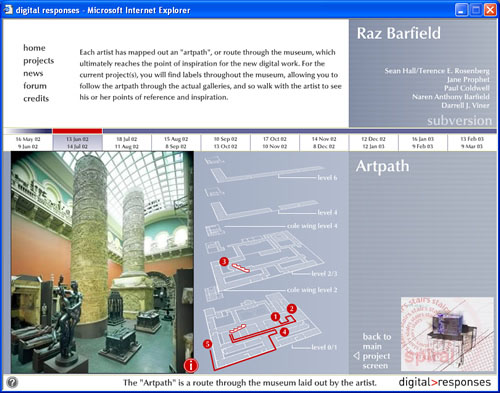
- For each completed project, a route through the V&A's permanent collection that flags the objects that are of interest or inspiration to the artist. We called this the 'Artpath'. Each of the participating artists has submitted his or her 'Artpath'.
- A bulletin board, or forum;
- Browser-based, so that we could post the kiosk on the V&A website.
We had several intentions with our kiosk:
- To offer alternative ways of navigating information about the exhibition, artists and displays, depending on the interest of the viewer;
- To open up the exhibition to a broader public;
- To create a place to submit feedback.
So, for example, someone interested in a theme, can find links to other works in the exhibition that tied in. Another person might be in the know, and go directly to a project by finding an artist's name. A visitor to the kiosk will immediately be able to identify which projects are on display by using the timeline. Anyone can submit a comment at any time.
Some of the ideas initially suggested as organising principles for the kiosk were embraced by the artists and the curator, and had a surprising impact on the exhibition. We were given free reign to propose ideas and designs, and were delighted when these actually had an effect on the way the curator conceived the show and guided the participating artists. The themes, which were originally proposed as an idea, divided the works neatly into roughly three equivalent groups and helped to focus the projects. The Artpath, in particular, proved useful both to the artists and to the museum. The artists, most of whom we have met, enjoyed the process of tracing a route through the galleries, and said that the exercise helped to focus their work. The V&A has printed out copies of the Artpath for the works on display. So, the possibilities offered by the technology of the browser had a reverse impact – i.e. affected the development of the artworks and the physical exhibition itself.
Fig.3. The artist, Raz Barfield's Arthpath through the museum.
Conclusions
Digital Responses resulted in an unusually productive collaboration between a museum, an artist/curator, a software provider and a design company. The conception and implementation of a web-based kiosk for the exhibition followed the curator's original objectives, but it also gave shape and direction to the show and to the artists' projects.
The kiosk also provides – on a small scale – an example of an online exhibition, as defined at the beginning of this paper. We paid attention to the things you would normally do when creating a physical exhibition. In the first place, the structure of the site was laid out as carefully as a floor plan in an exhibition might be. In this case, we only had one room to work with in the museum, so the information architecture (structure of the kiosk), in a sense, took over the job that the installation of physical works might have done to structure the material. The design was every much as important as the choice of wall colour or lighting would be in an actual space.
By using a browser as our platform (or exhibition space), we were able to do some things you would not with a physical show. We could link the content of the exhibition in a variety of ways, something that would not be possible in a printed catalogue or in a physical space. We were able to reach a broader public, by posting the site on the internet. Interestingly, we get many submissions to the forum from children, who might otherwise not be interested and who call for more interactive displays. And we were able to tie in the new digital works with the rest of the collection, without disturbing any of the permanent displays.
I would never argue that a digital exhibition would be preferable to a physical one – I believe the aim of any interactive display should be to spark interest and to draw people to the objects themselves. Yet projects such as the web-based kiosk we have shown here do offer several new possibilities, and even some advantages. In the future, it is to be hoped that museums can harness the capabilities offered by the computer in a truly creative way, to make exhibitions that present works imaginatively and that offer art historical perspective, both in digital and physical space.
November 2002